Tuesday, 7 May 2013
Sunday, 21 April 2013
Non-Human Anatomy
A pencil sketch of a Mallard. Immediately one can see that it is resting which is shown by the attention given to the head and breast. It is possible to get a feeling of implied line, travelling right to left, which is met with nothing which finishes the image at the wrong focal point.
Better observation of the markings would improve this images
Saturday, 20 April 2013
Figure
Another pastel drawing this time showing form.
More care has been taken with the arms, shoulder and head area keeping it well proportioned.
It is obvious in some places where observation wasn't focused, this is especially obvious with the left leg, I believe was caused by inexperience with that particular pose/leg angle.
Better observation on the shadows helps the image quite a lot in the upper third.
Friday, 12 April 2013
Tuesday, 9 April 2013
Monday, 25 March 2013
Friday, 15 March 2013
Still Life - Composition
The image above has been created to show finer points of composition. Using a more extreme angle, it is possible to see inside the mug and the way light and shadow is affected by the cylindrical form.
Scale is an issue here, and should be kept in check with pre-planning the image.
Monday, 11 February 2013
Still Life - Light and Shadow
This image was created to show light and shadow and how it reacts with shiny/matt objects.
Overall, the general proportions seem correct and the composition shows the scale of the objects quite well.
This image was completed without observation/references which could of been avoided with correct planning and efficiency when drawing.
Thursday, 7 February 2013
Still Life - Form and Shape
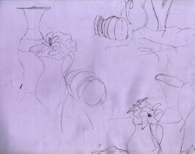
This image shows a still life arrangement from 3 different angles.
The sketch on the left has been chosen as it holds a greater composition than the other two. The tall container in the chosen image seems well proportioned and would suggest being aligned with the rule of thirds, this however; points out the less consistent observation on the container with the flowers, its lines are implying an odd shape which draws the attention to the centre of the image.
Places for improvement should be ellipses and smooth, single lines/Lighter construction lines.
Subscribe to:
Comments (Atom)


